UX Researcher / UX Designer
06 Spill App
A visual conversation at the speed of culture.
Tools: Figma
01 About
02 Design Process
03 Research
04 Wireframing
05 Results
01 About
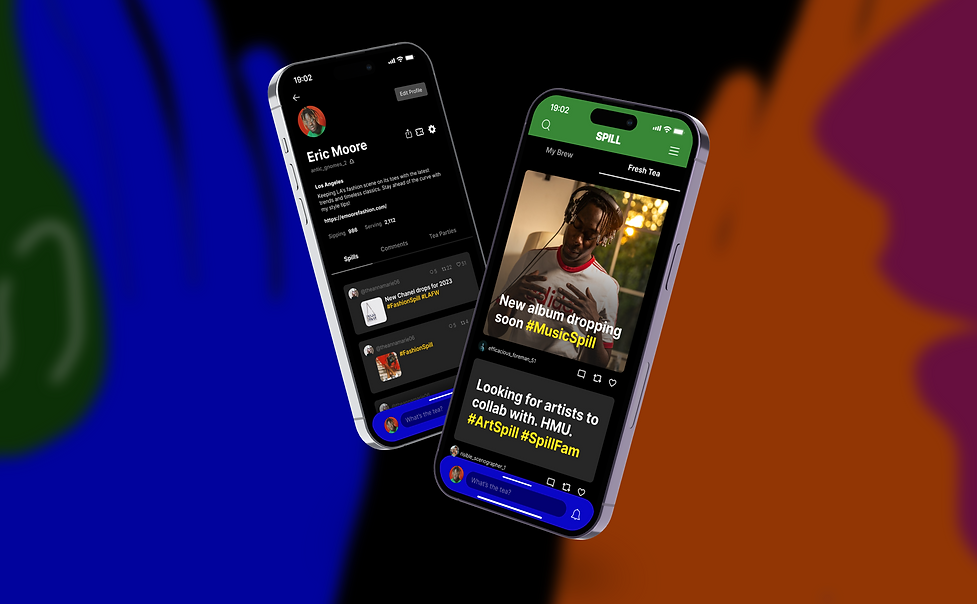
The Spill app was aesthetically pleasing but due to unconventionality, users had issues navigating the app effectively and remembering the meaning of icons. By changing the features that are accessible from the home page and implementing recognizable icons, I was able to create an interface that was more functional.
02 Design Process
Research
Audience
User interview
Competitive analysis
A/B testing
Prototyping
User flow
Wireframes
Functional prototype
Testing
User testing
Final corrections
03 Research
insights from first-time users
The first time users used Spill, they were unsure where to begin when entering the app. I researched the average flow users take when interacting with social media.
Social media user flow
The flow of the average social media user reflects the icons and calls to action that should be prominently displayed upon account access for intuitive and seamless navigation.


Original Design
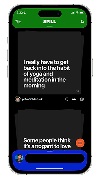
The original design of the homepage presents an obvious way to browse the user's feed and access their profile but it lacks a clear way to:
-
Explore and discover content
-
Post content
Redesigning with Intuitive Navigation
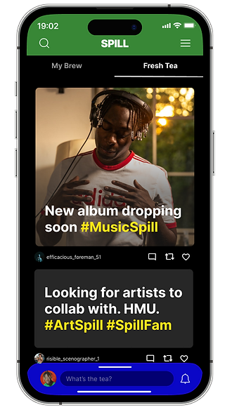
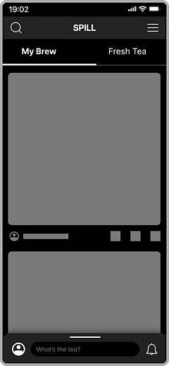
The homepage was redesigned to be more familiar to promote navigation by:
-
Replacing the Tea Party icon with a search icon and making the Tea Party feature accessible from the Search page
-
Including "What's the tea?" signifier in the input field for clear call to action


Insights from Previous Users
Users that no longer use Spill acknowledge that they would have like to see familiar icons so they would not need to think before interacting with a post.
Comparative analysis of social media post interaction icons
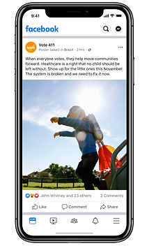
To better understand the challenges users faced when engaging with posts on Spill, we conducted a comparison of the post icons used on Facebook, Instagram, and X. Analysis revealed that the quotation and teacup icons were causing confusion among users. Specifically, it was unclear to users that the quotation icon was intended for reposting a post, while the teacup icon was meant for favoriting a post.


Recognizable Icons
In line with typical social media conventions, a heart icon is now used to 'like' a post, while the arrow icons are reserved for 'reposting' or sharing a post.
04 Wireframing
A/B Testing
The wireframe was designed with a navbar that was similar to most social media navbars. With the new post drawer being one of the app's distinguishing features, I tested users to see if it posed a challenge when using the app. During A/B testing I found that most users preferred the drawer.

05 Results
Enhancing Usability and Comfort
I improved the Spill app's usability and comfort by:
-
Incorporating familiar icons
-
Relocating settings to the header
-
Ensuring search feature visibility
-
Introducing discovery options within search
Reducing Navigation Time
The redesign reduced the time it took users to:
-
Create a new post: by 75%
-
Find user profile: by 75%
-
Locate search feature: by 90%
-
Access discovery features: by 80%
-
View Terms & Conditions: by 85%
Testing and Next Steps
We tested the new design with seven individuals. The results demonstrate a significant improvement in usability and user-friendliness. The redesign will be sent to the Spill App's creators for further assessment.


